Wednesday, November 11, 2009

Pretty Horses, Stone Ponies and a Mule

No, this is not the title to an old hippy folk song, LOL, this is a description to one of my latest functional art creations.  I’m trying the idea of making some small affordable original art to list in my shops.  When I was trying to come up with ideas for this I came across these small blank canvas pin back buttons made by Gypsy Goods. I thought, wow, this is a way someone could “wear” original artwork like jewelry! I asked if she had some watercolor canvas buttons because what was for sale was an all purpose canvas, which I wasn’t sure would work for water media paints, like my watercolor pencils.  Gypsy Goods was gracious enough to send me a sample to try out. I tried painting on the all purpose and the paint just didn’t work out, the canvas didn’t “set” the paint.

So after a few discussions she made some watercolor canvas buttons for me. I ordered a set in the 1.5” diameter and a few larger 2.25” diameter pinbacks. So next was then coming up with the tiny paintings. I have to say, it was quite challenging painting on such a small surface, but the canvas worked beautifully with my watercolor pencils.  I could finish each button in about an hour, from drawing stage, transferring to canvas and then painting. After drying for at least 24 hours, I then applied a protectant spray, and they were finished!

The subject of two of the pinback paintings is my cute little alabaster Navajo carved horse fetish I have. The actual carved horse is just a little bigger than the painting on the pinback.  The mule painting was a bit of a challenge, really trying to get the size of the ear and face proportioned  on such a small canvas. But I’m happy with the result!

I have them all for sale in my Artfire and Etsy shops, at $4 each plus shipping. I definitely have plans to do more of these, perhaps for magnets and actual buttons. I have lots of ideas to incorporate these canvas buttons as jewelry pieces, or key chains, etc. So many ideas and not enough time…..!

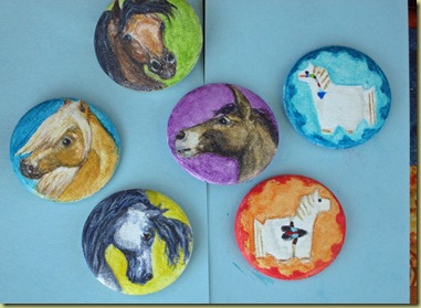
Pinback collection six pins

Saturday, October 3, 2009

WIP Horse in Bright Grassy Field Complete

My experiment with painting using an Aquabord clayboard surface is complete! Actually I finished the painting almost two weeks ago, went on with another project, yada, yada, yada….. So now here it is. Eventually I DO get around to all on the “to do” list! LOL!

Picking up where I left off on the last blog post, I had laid in some basic color of mid and dark tones, leaving the light areas so I could see where the light was landing. This is important because the warmth of light is going to be a focus in this small painting. I tend to work on one section of composition at a time, like the horse, the field, the front tree, the background trees. It helps me keep a reference for lighting among objects.

WIP midpoint workWIP midpoint horse needs correction

close-up on the horse: I wasn’t happy with the shape of the horses chest here

Close up on horse w chest error

So I did some erasing and streamlined the edge of the chest, wasn’t that hard on the clayboard surface.

finished horse close up board texture

And this is the finished result, using the scanner:

Finished scanned horse in grassy field_edited-2

Or under natural light:

finished grassy field painting on tissue

Or under outdoor shaded light:

Running horse in grassy field natural light

And close up on the horse:

Running horse close up finished natural

I’m a fan of the Aquabord now!! The title of  the painting is “Horse on a Golden Path” and is available in my Artfire or Etsy shop.

Next post, new project completed, cool Art Button Editions and Originals wearable watercolor pencil art!!

Wednesday, September 9, 2009

WIP continue Horse in Bright Grassy Field

In continuing this series of work in progress painting, the next step was setting up a composition grid. I take some tracing paper and outline the reference pic border, then find the exact center (so I know where to keep the painting focus away from.) I prefer to break into quadrants and then break the pic into horizontal thirds. Pretty much the classic rules of composition. Once that is done, I can then see where the subject focus (large tree on left, centerish trotting horse and background trees right) are to be drawn in position.

Composition grid layover of larger ref pic 

Next is to free hand draw the composition onto my painting board size of 5” x 7”. Why free hand, when I could just manipulate the pic in Photoshop to the size I need, and then just trace it onto the board? Because I want to do this to sharpen my drawing skills and train my eye to follow composition positioning. Sure it takes longer, and I have to erase a bit and start again sometimes, but I find it much more satisfying as an artist. I then create a composition grid on tracing paper for the 5”x7”, figure exact center and the horizontal thirds. Then the sketch begins freehand after marking the grid essentials on sketch paper. And here's the result:

Compositon grid paper on larger sketch

Composition grid of 5 x 7 freehand sketch


Ok, I then trace the composition using transfer paper onto the aquabord and now I’m ready to start painting. The first color layer goes in, I tend to push the darks first and leave the light areas white to see how that looks first.

First color layer on board

Close up of first color on horse

After a few reviews, I decided I need to erase some lines on my horse and large foreground tree. This aquabord is super easy to erase mistakes on, I love it! After the lines are tightened up, I then add some more color.

Progress w color treeline

And compared to the reference pic:

Progress second color w ref pic

So I’m pretty happy with most things right now, but I am honing in on what needs to be changed abit.  So the next blog post will be more along what I can tweak, the real “meat” of painting which I love!

Saturday, August 22, 2009

New Work in Progress painting Trotting horse in Grassy Field

Recently I've discovered a new painting surface board to try, the Ampersand brand Aquabord. This product is a clayboard that's textured for watercolors, and can be displayed without glass in the frame. I actually haven't painted on it yet, so I'm starting with the small size (5"x7") to get a feel for how it's going to be to paint on.

For these small paintings, I wanted to keep the composition pretty simple, after all this is a first try on the Aquabord. Two ideas came to mind, a horse in a field and a horse jumping a creek/ditch in a southwest landscape. Off I go to the reference pic library on WetCanvas (where artists can use volunteered pics with permission for painting references). There are hundreds of pics to go through but it wasn't long until I found the first reference pic, a beautiful composition of a trotting horse in a golden grassy field in front of woods.

When I start a painting I like to do a little homework first. One of the first things I do is work out a tonal sketch in pencils. Keeping things simple, my mantra, I work out the darks, lights and medium tones in the composition with 2B, 4B and 8B pencils. All I do for this is just print out the pic on my printer and trace the outline on sketch paper. Sketch size is 7"x7" approx. I did not want the fenceline in the painting so I left it out.

Once that is done, I'm then ready to do a simple color sketch, which helps me to see what colors to start the first color layer with. This way I can get a "sneak peek" when the painting will go and how to start the tweaking process. The color palette I used was treeline: Indigo, May green, Olive green (derwent brand), pea green (cretacolor), dark pthalo green (faber castell), tree trunks are in sepia (derwent): horse in french grey (prismacolor)(I left the horse in neutral color on purpose): grassy field and shadows: ivory (cretacolor), burnt umber, blue grey,burnt sienna, primrose yellow, gold, deep cadmium, middle chrome and flesh pink (derwent).

By doing the pencil and color sketch, I start to get a feel for the painting outcome and a helpful guideline. Now the next step I will do the architecting of the painting; freehand transposing the sketch to the actual painting size and setting up a composition grid to make sure the painting objects are balanced. This way I can be sure to create a visual "flow" across the painting. So that will be the subject for the next blog posting.

Sunday, August 16, 2009

They're ready for a new home, the mini journals that is!

After what seems like a revisit to writing college term papers, the listing descriptions of each southwest wildlife mini journal are complete! The journals are available for purchase in my Artfire and Etsy online shops. Although in Artfire, I could go more into the inspiration for each journal in the listing. I feel good that this step is finished, and the next step is hopefully shipping them off to a happy buyer soon! Have a great and blessed day!!

Thursday, August 13, 2009

Southwest Wildlife Mini Hiking Journals are here!

The southwest wildlife design, handmade, original mini journals are finished!! Oh my God, I can't believe it's taken me this long to complete this project. *Sigh*, real life pulled my creative energy out of me for about six weeks. But I'm not going there, this blog post is about celebrating one of my original design of functional art!


Initially, I got the idea about making a mini journal to use when hiking or riding down the trails. For those of us who enjoy these activities, sometimes you can just get such a rush of feelings while out in country, you just want to write it down! I thought, why not make a small journal that can be put into a zip-lock bag but make it with an original watercolor pencil painting and theme it with corresponding natural beads/stones. Each of these journals has a theme as to selection of animal, background and beading.


For this journal, my theme is the feral mustangs on the north desert Nevada range. One day, I hope to see the Mustangs in this natural habitat, running the range where abandoned gold and silver mines keep them company. The background represents the mountain ranges typical of that area. The stones I selected to compliment the painting are turquoise and sterling silver beads, because of natural turquoise and silver mined in Nevada. The natural turquoise beads are from the Fox mine area in western Nevada. I am a turquoise nut, ahem, I mean collector and I try to choose southwest USA mined beads in my functional art creations (as best as from the source of info I can gather).


I know that I'm going to sound like a broken record here but when I saw the Grand Canyon south rim for my first visit this spring, I was so inspired!! I took tons of pics but I really need to go back and take more, for painting references you understand! LOL! I loved being there and lucked out and hired a semi private guide who was helpful in talking about the wildlife in the canyon. Elk are predominant on the south rim, and while we were there, I saw some elk scat (manure) pile really close part of the canyon trail edge. So this painting is my attempt to try to catch some semblance of the beauty of what is the Grand Canyon and one of the natural wildlife species that walks the trails as its home! I had a tough time choosing beads to match the theme of my painting, as I was looking for natural gemstones/minerals of the Grand Canyon or Arizona that would be small enough and affordable to use. After some research I came across info of the Arizona fire opals but didn't find the sizes needed available. What I did find, and decided to use was the Mexican fire opal beads as a close second choice . The colors and "fire" match those of the Grand Canyon walls. The other beads are antiqued copper beads, as there is some copper found in the GC, and I thought antiqued copper would represent the ancient history of the wonderful canyon. To the Grand Canyon I say, "I'll be back!"


How can I call myself a southwest wildlife artist if I don't include at least one painting of a buffalo! This painting idea came from my goal of one day visiting Yellowstone National Park and seeing the natural buffalo that freely roam among the geysers. While gathering my reference materials for the painting, I was blown away by how painters of buffalo seem to portray the great beast with such reverence and presence. I like to think my painted buffalo here is small but mighty!! Now what turned out to be a real gem for me was in my research for a natural gemstone of Yellowstone river area I found Montana Agates. And was lucky enough to find a source of the Montana Agate in the bead size I could use from a natural stone cabber in Montana. The natural Montana agate beads are flanked by copper beads to reference the copper mining around that area. I really like the beads a lot!

So there they are, completed and they turned out just as nice as I had hoped! It was quite a journey getting these small journals finished, a lot of reflection in the time they took. They will be up for sale in my Artfire and Etsy stores soon. Thanks for visiting and happy travels!

Thursday, June 11, 2009

Hiking or Riding Mini Journal Update

Huff, huff, that's me blowing the dust off of the blog posting! LOL! I know I've neglected posting updates, but that doesn't mean I haven't been creating. Let's get to it!

The mini journals are approx. 4"x4" size. These are my first run, first time making this type of journal. As part of the functional art guidelines I have, this journal should be user friendly and yet be a work of art. So I took a regular size paper and divided it into thirds, like folding it to put into a business size envelope. The paper used is a handmade faux dark brown leather, it's one of my favorites! Then I played with a few ideas of paper combinations until something suited me. Now, what kind of lacing? I had some black leather cord I knew to use, and decided on trying a zig zag formation, like three mountain peaks. Played with that a bit, I was smart this time and made a template of how to measure the holes to punch and to figure out the lacing. I secured the lacing by using a crimp tube for necklace making on the back of each journal. Who knew I would actually use some geometry in my art projects, I really did use my protractor for the template! (Draftsman I'm not, but I can get by). Gold parchment paper was used for the pages, and I hand cut all sheets. As the booklet was forming, I felt like it needed a real leather border, so I got some of the Tandy leather scraps bag with black leather. Experimented a bit with measuring leather strips and got a leather border glued on each of the three journals. This is one area I will do a little different on the next set of journals. I like the look, but my gluing skills are a little rough. As a result, the inside covers with the leather borders looked rough, so I added a silk paper liner inside to cover up the leather gluing process. Figured that was a smart move on my part, LOL!!

Now for some pictures showing the process of creating the paper journals and binding:


Next post, the choosing of the beads and theme of each journal!

Monday, April 27, 2009

New Project, Hiking/Trail Riding Journals

With the Unicorn painting finished, and listed on both Etsy and Artfire (and Twittered!), time for my latest functional art project. Small, hand held size hiking or trail riding journals. These journals will be embellished with natural stones or silver on the leather lacing and then a miniature painting on the cover. I think these will be very unique.

My theme is wildlife and landscapes of the southwest. I plan on using stones that are natural to the landscape depicted for the journal decoration. For example, one journal cover will feature the feral mustangs of Nevada, and I will be using natural (as possible) Nevada mined turquoise and silver beads. Reason being, Nevada is well known for it's illustrious turquoise mines and of course the abundant silver mines. I will also make two additional journals, plans are for an Elk looking over the Grand Canyon (copper and silver beads) and a Buffalo (bison) in Yellowstone (still deciding on stones; need to do some more research).

So I have the theme selected, still need to get more reference material together for the miniature paintings. I have cut all the paper out and am ready to start binding the journals. I'm thinking I will bind and bead each journal first, and then get started on each matching painting. My time is now directed on this new project; I'm excited to see how these will turn out in time! I'll keep on with updates every week!

Tuesday, April 21, 2009

New Painting, Black Unicorn Bust


After the lake painting I was ready for another horse subject. Here is my latest completed project, called "Northern Unicorn". Done in watercolor pencils, 136# watercolor cold press paper, size is 9" x 12". I worked on this painting for weeks, I had a stretch where I was either too tired, out of town, or uninspired to do any progress with it, which accounts for the length of time to get it finished. I'm just not one of these artists that does a painting a day! However, it feels good to call this painting finished.


I had the idea for this painting a while back. Sometime last year, I was looking through reference photos on WetCanvas Reference Library. When I saw this photo of a Friesian horse, a unicorn immediately popped into my head! So I filed it away, bookmarked it for another time! Sometimes a story unfolds in my mind when I see certain photos, and this black, strong, powerful, beautiful horse head somehow made me think of a unicorn in a Celtic forest, forging an adventure in a mystic land.


I worked on some other projects first for a while and then I got to thinking about my unicorn again. And so now it was his turn to come to life from my thoughts to paper. First I gathered some reference prints, close up of that mane and a pic of highlighted light sources:


From here I made a full size sketch using 6b drawing pencil, trying to get the perspective right and practicing my freehand sketching.

For my colors I used my favorite combination for a vibrant black which is ultramarine, pathlo green, and crimson red, with additions of burnt umber or indigo as needed. For highlights I used violets and turquoise, some peach or pink. Background is mostly warm greys, light ochre and sanguine orange, with lots of loose water to push the colors around. The horse is painted with a more controlled application of water on the pigments.

I'm happy he's done, I was ready . I plan on getting this painting, along with two others, listed on my Etsy and Artfire stores. I'll enjoy my Northern Unicorn until he gallops to another admirers home!

Thursday, March 19, 2009

Painting Wet, Lake with Boat landscape

Sometimes I try my hand at painting other subjects outside my usual interest (horses, southwest themes). So I decided to stretch my art skills at painting a small fishing boat on a lake. Painting water is very interesting, from what I studied, water is a reflection of the surroundings but yet needs to yield a fluid appearance. To me, like moving shadows, layers of shadows. I found I needed to be in an abstract frame, colors that would flow directly into one another. I decided it would be fun to document this try at painting water as a WIP (work in progress).

Here is the initial sketch, on sketch paper, with a reference photo:

And a close up of the composition sketch:

Now I drew the sketch on to the watercolor paper. First color sketch of darks (indigo) and neutral green, painting size is approx. 10" x 6" on 136# cold press paper:

And the first layer of the landscape colors added, my focus on keeping the highlights blank, pushing more dark and middle ranges:

Next, I'm adding more middle values, filling in the boat and fisherman. I decided I wanted to add some depth to the background. I tried to recess the middle trees as a secondary treeline to imply the lake flows further between the initial treeline. I'm not sure it works splitting the treeline into two parts. Used more greys on the small back treeline.


Now working on the lake highlights. I used more greens and violets to accentuate a warm still quietness for the water. Fishing is supposed to be a relaxing activity!


With all three tonal values in now, (light, middle and dark), I went to work on creating more depth in the water, shadows of the treelines, punching the clouds and sky depth and color.


I continued to go back and forth on adding depth more blue to the water, more blue greens for the treeline water shadows and the fisherman and the boat. I then wanted to add some highlights to the water, adding those special reflective sparkles, making water like a faceted jewel. Finally, I decided that I had to finish, and leave it as is as I felt myself starting to over tweak the painting. And now, the finished painting:


I'm ok with the outcome; I learned a lot, like waterscapes just may not be my thing! But, I can't say that I won't do another water themed painting in the future. Funny thing though, I found myself thinking about all sorts of new horse painting ideas while thinking about painting water!

Wednesday, March 4, 2009

Homegrown Business Cards


My business cards I had printed quite a while ago from Zazzle have been outdated as far as web addresses so the time is right for new, updated cards. So I decided to give it a go on my own, using my Photoshop Elements program. I did not use a business card template, just used the DVD jacket label option and poke and prodded around until I could figure out what went where! Does that make sense? LOL! Real techie bable here. For the last few weeks I've been working off and on on design, colors, tweaking things here and there. Finally I pretty much decided before I get too caught up in "paralysis of analysis", just go with what I had done! The result is the two card designs here.

I'm also going to experiment with printing the cards on 100# bristol paper and acrylic "canvas" paper. Which of course means then I will have to cut the cards myself. Yea, I can be quite the "do it yourself" person. But I really don't need tons of cards right now, so why not!

I plan on sending out the cards whenever I can, I have a friend who did me a big favor with sending some horsemanship teaching materials she had access to and I will be sending a little thank you gift to her, along with a couple of these cards.

It's fun pretending to be a graphic designer every once in a while!